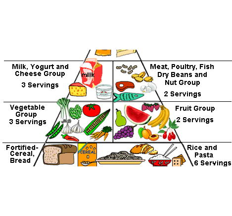
The new graphic will replace the much maligned FoodPyramid with a cleanly-designed dish divided into wedges that represent the basic food groups – fruits and vegetables, grains, protein, and dairy, said the National Fisheries Institute (NFI)
Paired with messages from the DGA to distinguish healthful choices from less healthful choices within each food group, the graphic and campaign surrounding it are designed to help consumers visualize just what a healthy plate should look like.
The new campaign is expected to emphasize recommendations to swap out some foods for healthier alternatives, like fat-free or low-fat for regular dairy and water instead of sugary drinks.
NFI’s